
I lifted the following article from PKD Media.
There have been many major changes going on at PKD Media this week, and with artist/co-creator Chad Cicconi and writer/co-creator Shawn Pryor now working extensively with Action Lab Entertainment, many thought that the buddy-cop comedy team of “Mercury & the Murd” would come to an end.
However, that is the furthest from the case. In fact, “Mercury & the Murd” is stronger than ever and moving forward. Today PKD Media announces writer Mike Imboden and artists Rian Miller & Jason Meadows as the new creative team for Volume Two of the buddy-cop action series tentatively titled, “Down & Dirty.”
“I knew that I was leaving Mercury & the Murd in good hands with Mike (Imboden),” said Shawn Pryor, who is serving on the book as the plotter & editor. “I was so worried that we wouldn’t be able to continue the flagship franchise for PKD Media, and I was already being overwhelmed with the amount of work I was already taking on. I had formulated all the plots for Volume Two, and Mike has been able to take these plots and transform them into well written, fun, character driven stories that have everything for fan of the series and first time readers.”
Many readers know of Mike Imboden as creator of the popular Fist of Justice comic book series, which is currently being shopped for film treatment. He also spearheaded bringing artist Rian Miller to the project as well.
“Mike e-mailed some rough sketches that Rian (Miller) did of Mercury & the Murd and as soon as I saw them the green light was given for him to handle pencils & inks. Jason Meadows (of LeadSlinger Studios) & I go back a few years and he’ll be laying down the tones & lettering. Rian & Jason are hard workers so when the book is ready to go to press it’ll be top-notch. Plus it’ll have a beautiful cover by Jun Bob Kim & Steve Bryant. What’s not to love?”
Mercury & the Murd Volume Two is set to debut at the Comic Geek Speak Super Show on April 30th, 2011.
For further details, contact pkdmail [at] pkdmedia [dot] com
Showing posts with label Art. Show all posts
Showing posts with label Art. Show all posts
Thursday, October 28, 2010

Thursday, May 20, 2010
My Latest Obssession: TeeFury
A month or three ago I discovered a website called TeeFury.com, where a new limited edition t-shirt is made available every day for the low price of $9 (with $2 s/h). All of the designs are by artists from around the internet who get to keep the rights to their artwork after their shirt has finished it's 24 hour run on the site. Since discovering TeeFury, it has become one of my new daily go-to sites and I have ordered 7 of their shirts to date.
(click images to enlarge)
I first found my way to TeeFury's site after seeing this design (available at TeeFury.com on May 10, 2010) posted on an Alien-centric blog:

Unfortunately, I was a few weeks too late to order that shirt, but as fate would have it, the day that I first visited TeeFury.com (May 30, 2010) was the same day that this LOST-inspired shirt was available:


I ordered one on the spot and haven't turned back since. I also began taking photos of myself wearing the shirts with my shitty cell phone camera and posting them on Twitpic. The following are the next 2 shirts that I ordered from TeeFury on April 16th and April 23rd, respectively:


On April 20th, TeeFury had a Grab Bag sale which allowed buyers to order between 1 and 3 of their recent shirts (those originally released between February 16 and April 19, 2010) for $5 each instead of of the usual $9. The catch being that you wouldn't know which shirts you would be receiving until they showed up at your house. I couldn't pass up that deal, and ended up with the following 3 shirts for a mere $17:


I almost bought the first of the 3 shirts listed above when it was initially available (April 18, 2010), so it was a pleasant surprise to find it among my randomly selected trio. The second shirt made it's debut before I'd discovered TeeFury (February 28, 2010), but I like the design. The third (available on April 4, 2010) is my least favorite of the 3, but it's already gotten me a few compliments, so I'm not complaining. In fact, it's worth noting that every single one of my TeeFury shirts has gotten complimented, or at least been pointed out or recognized, by complete strangers when I've worn them in public. It just goes to show how great the designs by TeeFury's stable of artists are that they incite so many reactions when people see them.
EDIT (July 9, 2010):
Since the original posting of this blog, I've accumulated a few more TeeFury shirts chich I'd like to share. The first two of the three shirts below were no-brainers for me to purchase, being based upon LOST/Back To The Future (available on May 18, 2010) and AVATAR (available on May 20, 2010). The third, while featuring a design based upon the Stay Puft Marshmallow Man (available on May 25, 2010), is rather similar to the previous Ghostbusters shirt that I got from the site. I had told myself that I wasn't going to buy one, but as the day drew to a close and my opportunity to own the shirt was about to disappear forever, I felt compelled to just go ahead and order one. Why the hell not? They only cost $9, right?


Then, on June 15, 2010, TeeFury held another Grab Bag Sale, which I once again jumped at the opportunity to be a part of. I ordered three more random shirts for $5 each and ended up with El Boba (originally available on May 19, 2010) and Zombie Ninja Pirate (originally available on May 21, 2010). The third shirt I received with the June Grab Bag was one that I knew I'd never really wear, so I traded it to one of my co-workers for a copy of the card game Monopoly Deal. I've already gotten more use out of the game than I would have gotten from the shirt, so everybody wins.


You can visit TeeFury.com and/or follow TeeFury on Facebook or Twitter.
Saturday, January 30, 2010
Flowering Nose Day
Today is the four year anniversary of the death of one of my favorite artists: Seth Fisher.

I met Seth at the 2005 San Diego Comic Con, which is also where I discovered his art for the first time. As I perused the "Fat Naked Rave" booth, Seth was doing karate moves and jumping around like a crazy person behind the tables where other members of the studio were sitting, signing books. I had no idea that he was an artist because in addition to his kung-fu fighting, he was wearing a bandanna around his head, big raver goggles, and a pair of overalls much like a janitor would wear, unzipped to the waist to reveal a comic-related t-shirt.
I walked up to Seth's table, not knowing that it was his (having never seen him or his art before) when he came running over and pounced into his chair, immediately striking up one of the most bizarre convention conversations I'd ever had. Before leaving the booth, he'd convinced me to buy his and J.M. DeMatteis' Green Lantern: Willworld graphic novel, which was well worth the money and is the work that really sent me on my search for more of his art. I also bought a copy of his sketchbook, upon which he did an ink drawing of me.

When a classmate at the Kubert School informed me that he had died, I couldn't believe it. Seth was in his early thirties and based on his demeanor at the show only a few months prior, seemed to be in perfect health. As it turns out, Seth had fallen seven stories from the roof of a club in Osaka, Japan, not far from where he lived with his wife Hisako and their son Toufuu.
The following is from an old article that I found on Newsarama:
"Fisher, a 1994 graduate of Colorado College opted not to use his math degree professionally, and moved into illustration shortly after he graduated. Fisher also moved, literally, to Japan shortly after graduation, where he taught English, refined his art, and eventually married his wife, Hisako, with whom he had a child. Fisher had been currently living in Nagoya, Japan with his family.
Though he moved away from math professionally, it still played a role in his art. In an interview with the College of Colorado Bulletin, Fisher described his view of art as: 'Art is really just problem solving in action. You start with a few lines, then you try to balance those lines with other lines compositionally, then you balance that with trying to explain a certain space or emotion.Perspective, composition, timing, and color theory are technical skills. You have a problem, and you have this toolbox full of techniques that you use to paint a totally unique bridge from an assumption to its implications.'"

Over the last few years I've accumulated just about every comic book that Fisher had drawn, and was excited to discover that his blog is, in fact, still active. Seth's mother Vicki updates http://floweringnose.blogspot.com/ fairly regularly with examples of Seths work and her thoughts on his art and his legacy. The following is a quote from her most recent post, dated January 28, 2010:
"Last year some of Seth's siblings declared January 30 Flowering Nose Day, a day to encourage artists, to take risks in order to do something worth doing, to create something that delights you, to have fun doing whatever you are doing, to do your best at whatever you do, to remember Seth by stretching out your arms and loving what you are doing and who you are with. I am all for it."
So with that in mind, I invite anyone reading this, be it January 30th or any of the other 364 days of the year, to do just that. Be creative and have fun doing so.

Saturday, September 12, 2009
Richard Corben's Non-Comics Work
"Richard Corben is the best comic book artist ever."
That's not something you're bound to hear a whole lot of people say. Honestly, I'm not going to say that either. However I will say that Corben shares the title of "my favorite comic book artist" with Travis Charest, meaning that I like his artwork a whole lot to say the least.
If you know me personally, you've probably seen a lot of Rich's comic book covers and interiors as I am known to champion them to anyone within earshot (and eyeshot) whenever the chance presents itself. What most people (even those who call me their friend) are probably not familiar with, however, are Corben's works of art outside of the comic book industry.
If you plumb the depths of a stack of dusty old science fiction paperbacks in the corner of a mom and pop used book store you've got a pretty good chance of uncovering one or two titles with Rich's work adorning the cover. However, to hunt down and display those here would undoubtedly have an unpleasant effect on my sanity, so instead what I've got to share with you, my beloved readers, are some more mainstream works of art.
CLICK ANY IMAGE TO ENLARGE
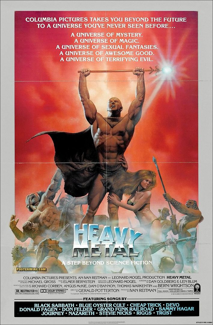
First, we have the one you most likely have a pretty good chance of having seen before. This is one of two posters produced for the Heavy Metal movie from back in 1981. The other poster (which you can view here) is the one most people know because it has been used for all of the packaging and promotion of the movie on DVD and Home Video over the years. If you'd gone into a theater showing the film back in '81 though, you probably would have seen one of these bad boys, which prominently features Corben's own creation, Den:

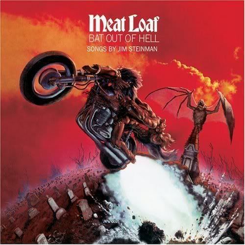
After the Heavy Metal poster, the non-comic book Corben painting the average person is most likely to have seen (depending on your music taste) is the album cover for Meatloaf's Bat Out Of Hell. Apparently this artwork was a rush job (though I'd be hard pressed to prove it based on the quality of the art itself) which arrived at CBS records less than one week from the day they commissioned him to paint it. Amazing!

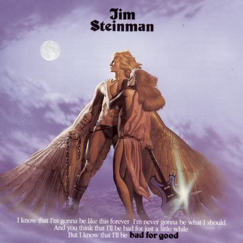
Now we get into the more obscure work. I'd never heard of Jim Steinman before, but according to Wikipedia he's a record producer, composer, and lyricist who has worked with Meatloaf on multiple occasions, which explains how he ended up with a Richard Corben painting on the cover of his album Bad For Good:

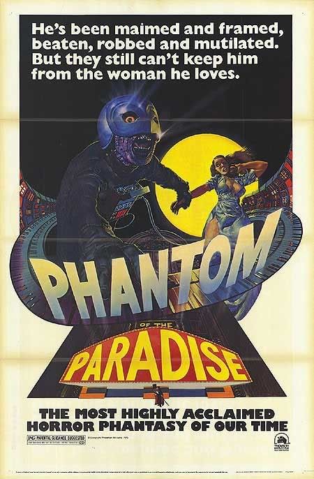
Now here's one that I found truly bizarre. Everyone's heard of Brian De Palma, director of such films as Carrie, The Untouchables, Scarface, Carlito's Way, and Mission Impossible. But did you know that in 1974 he wrote and directed a rock opera version of The Phantom Of The Opera called Phantom Of The Paradise? Well, if IMDb is to be believed, he did just that and Richard Corben painted one of the original posters for the movie. For those who have seen the Berserk anime or read the manga of the same name, is it just me or does that dude in the mask remind you of Griffith when he's got his helmet on?

Last, but not least, we have the movie poster for a no-name 80's horror movie called Spookies. Apparently it's one of those "a group of people spend the night in a haunted house" flicks. Having looked up the directors and "stars" of the film on IMDb, even though I've never actually watched it, I can pretty much surmise that this poster is the best thing about the movie:

In closing, I'd like to give props to the internet in general for helping me to discover, locate, and share these pieces of artwork with others. Of note is an absolutely invaluable resource for anyone wishing to learn more about Richard Corben, which goes by the name "The Most Complete Comicography Of Richard Corben", or Muuta.net for short. Then of course there's Richard Corben's personal site: CorbenStudios.com.
Now go spread the word: Richard Corben is (one of) the best comic book artist(s) ever.
That's not something you're bound to hear a whole lot of people say. Honestly, I'm not going to say that either. However I will say that Corben shares the title of "my favorite comic book artist" with Travis Charest, meaning that I like his artwork a whole lot to say the least.
If you know me personally, you've probably seen a lot of Rich's comic book covers and interiors as I am known to champion them to anyone within earshot (and eyeshot) whenever the chance presents itself. What most people (even those who call me their friend) are probably not familiar with, however, are Corben's works of art outside of the comic book industry.
If you plumb the depths of a stack of dusty old science fiction paperbacks in the corner of a mom and pop used book store you've got a pretty good chance of uncovering one or two titles with Rich's work adorning the cover. However, to hunt down and display those here would undoubtedly have an unpleasant effect on my sanity, so instead what I've got to share with you, my beloved readers, are some more mainstream works of art.
First, we have the one you most likely have a pretty good chance of having seen before. This is one of two posters produced for the Heavy Metal movie from back in 1981. The other poster (which you can view here) is the one most people know because it has been used for all of the packaging and promotion of the movie on DVD and Home Video over the years. If you'd gone into a theater showing the film back in '81 though, you probably would have seen one of these bad boys, which prominently features Corben's own creation, Den:
After the Heavy Metal poster, the non-comic book Corben painting the average person is most likely to have seen (depending on your music taste) is the album cover for Meatloaf's Bat Out Of Hell. Apparently this artwork was a rush job (though I'd be hard pressed to prove it based on the quality of the art itself) which arrived at CBS records less than one week from the day they commissioned him to paint it. Amazing!
Now we get into the more obscure work. I'd never heard of Jim Steinman before, but according to Wikipedia he's a record producer, composer, and lyricist who has worked with Meatloaf on multiple occasions, which explains how he ended up with a Richard Corben painting on the cover of his album Bad For Good:
Now here's one that I found truly bizarre. Everyone's heard of Brian De Palma, director of such films as Carrie, The Untouchables, Scarface, Carlito's Way, and Mission Impossible. But did you know that in 1974 he wrote and directed a rock opera version of The Phantom Of The Opera called Phantom Of The Paradise? Well, if IMDb is to be believed, he did just that and Richard Corben painted one of the original posters for the movie. For those who have seen the Berserk anime or read the manga of the same name, is it just me or does that dude in the mask remind you of Griffith when he's got his helmet on?
Last, but not least, we have the movie poster for a no-name 80's horror movie called Spookies. Apparently it's one of those "a group of people spend the night in a haunted house" flicks. Having looked up the directors and "stars" of the film on IMDb, even though I've never actually watched it, I can pretty much surmise that this poster is the best thing about the movie:
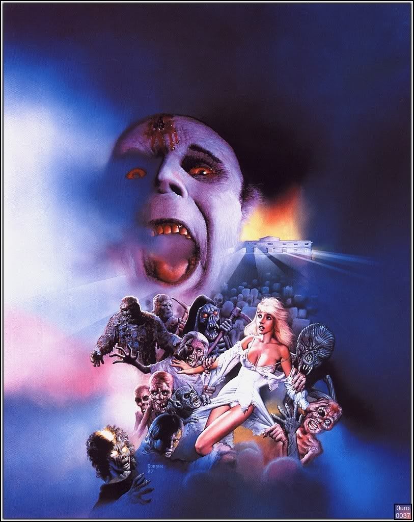
In closing, I'd like to give props to the internet in general for helping me to discover, locate, and share these pieces of artwork with others. Of note is an absolutely invaluable resource for anyone wishing to learn more about Richard Corben, which goes by the name "The Most Complete Comicography Of Richard Corben", or Muuta.net for short. Then of course there's Richard Corben's personal site: CorbenStudios.com.
Now go spread the word: Richard Corben is (one of) the best comic book artist(s) ever.
Wednesday, May 13, 2009
Cool Posters For Upcoming Sci-Fi Movies
Some (myself included) would say the art of movie posters isn't much of an art anymore, so it's incredibly refreshing when I come across a movie poster that really inspires me to see a movie on it's own these days. I was just researching some films for My Movie Radar and discovered a couple of cool posters for some sci-fi movies coming out in the near future. Check 'em out:

This poster for Moon is easily the most awesome retro movie poster I've seen since this one for last year's highly underrated Jason Statham heist film The Bank Job.

This one also gives me a retro vibe. It may be the color scheme, but I think the main thing that gives me that nostalgic feeling is the small inset pic of the guys walking through the desert. When I look at that image I can't help but think of the beginning of Planet of the Apes. Then, of course, there's the fact that the character in the larger image looks an awful lot like Boba Fett...

This one's got a more modern feel, but it's still pretty neat. I almost think it would work better without the text.

It's hard to say with any certainty how effective this poster is considering that this is the largest picture of it that I could track down via Google, but even a minute, blurry image such as this outshines the other two (one & two) typical, uninspired posters for this film. It almost looks like the cover to some old, tattered sci-fi paperback you'd find packed away in your grandfather's basement or something.
Saturday, May 9, 2009
Advice To Future Students
How I Learned to Stop Worrying and Love
The Joe Kubert School of Cartoon and Graphic Art
As my third and final year at the Kubert School drew to a close in 2006, our writing teacher Mike Kraiger asked each of his students to write two final papers for him. One of those papers is what I'm posting here: a list of advice for future students. To my knowledge Kraiger never actually showed these lists to any of his incoming students, which is probably a good thing. Mike had a good sense of humor though, so we were all encouraged to be completely honest with the assurance that none of the other teachers or staff at the school would ever see what we had written. As I was looking for some old Broken Legacy work on my ancient hand-me-down IBM Thinkpad, I came across this list and got a few good laughs out of some of the things which I had written and subsequently forgotten about over the course of the last three years. So here, edited only for grammar and punctuation, not content, is my list of advice for future students of the Joe Kubert School of Cartoon and Graphic Art.
Oh, and the second of those two papers Kraiger asked us to write? It was a person by person critique of each of our instructors at the school. I may post that one at a later date as well, but I fear that my commentary may have been a bit too biting in that paper. Anyway, here we go.
- To avoid unnecessary headaches (and poverty), use the school's copy machine only when absolutely necessary.
- Concerning copies to be made off the premises of the school: bite the bullet and drive the extra few minutes to Kinkos. Their employees are, as a whole, far less incompetent than those of any of their competitors.
- Time Saving Tip: Ink "spilled" on the back of an assignment (obscuring a given grade) will allow it to be turned in for more than one class.
- Time Saving Tip: Weed out the assignments that are less important and/or less interesting than others and employ the use of tech pens, RoseArt non-toxic watercolors ($0.94 at Wal-Mart), and a simpler, 'cartoony' style on them.
- Painful as it may be, make each teacher feel like you're holding their current assignment in the highest regard.
- For the sake of concentration, if you insist on having a television in your possession, DO NOT get cable.
- Likewise, the internet is not recommended.
- Also, it is unwise to keep a bookshelf of your favorite books and comics within arm's reach of your art desk, or even in your peripheral view.
- If you have no interest in pursuing a job as a computer colorist, don't feel the need to color every single assignment in Photoshop. There are much faster ways to color (i.e. the aforementioned RoseArt watercolors).
If you are living in the school-provided housing (or if you have roommates regardless):
- Keep a list of all of the DVDs, CDs, Comic Books, and other assorted valuables that you have in your possession to make it easier to keep track of what's gone missing.
- Shower at night as those few extra minutes of sleep will seem precious the next morning while everyone else is fighting for the bathroom.
- Do not leave your toothbrush and toothpaste in the bathroom, but instead keep it in your room. This way you can brush your teeth at the kitchen sink in the event that someone is holed up in the bathroom all morning.
- Make a habit of reusing the same cup, plate, etc. so that when someone starts bitching about somebody not washing their dishes you have an alibi.
- Become friends with the office ladies. It will pay off eventually.
- Pretend to laugh at Mike Chen's jokes. There's no way to really get on Debbie's good side (presuming that she has one), so Mike is the next best option.
- While in the classroom, employ the use of headphones and a discman or MP3 player to block out distracting conversations which will draw you in and go nowhere for extended periods of time (i.e. "Who would win..." and "Well, I think Spiderman 2 is better because...").
- For privacy while attending to 'business' at school, use the upstairs bathrooms.
- Don't get yourself too worked up over the DC and Marvel portfolio reviews. While everyone involved means well and it can be a worthwhile experience, the companies in question take these events much less seriously than the school does.
- Difficult as it may be, try to choose a desk in the classroom that is surrounded by classmates who bathe regularly. This will prove increasingly important as the summer months approach.
- What seems like a friendly argument of opinion can draw the line between enemies and give sarcastic classmates weeks, months, or even years worth of material to use against you. Avoid them as much as possible.
- Tempting as it may be, a trip to Taco Bell at lunch will almost always result in being late to your second class.
- To separate the men from the Dorians, if you must talk on your cell phone during class, leave the room first.
- Car pool.
- Get a digital camera and take reference photos. It's time to stop pretending.
- While the school is preparing you to be a professional, unless you're getting paid for your work, a missed deadline is worth a better final product and a more impressive portfolio.
- When showing your work to Irwin, make sure a sheet of tracing paper is strongly secured over your pages.
- Don't rush every single assignment. At any give time you should have at least one assignment that you are trying your absolute best on.
- Considering that the school is located in Dover, New Jersey, learning a little Spanish couldn't hurt.
A Feast For The Eyes
I have to imagine that if you're reading my blog you probably know me in some regard, because I kind of doubt that I'm drawing any new fans/readers with posts about Beyond Re-Animator and what I've bought recently. So since you already know me you must know that Jesse Munoz and I have been collaborating for some time now on a potential comic book series called Broken Legacy. You did know that, right? Of course you did.
Well, as of late we have been refining the project and preparing (what we believe to be) a pretty solid pitch package to begin sending off to prospective publishers (damn, that's a lot of "P" words...). As of tonight we're about 99% done with the pitch. We've just settled on the final cover image that will serve as the visual backbone to the pitch, and so excited are we that Jesse and I are giving you, the people, a sneak peek at said cover image. So sit back, moisten your eyeballs, and prepare to gawk, because here it is in all it's color-ific, be-logo-ed glory:

And while I'm at it, just for kicks, here's a quick excerpt from the pitch itself:
As soon as Jesse whips up the actual pitch packets and sends them my way to give the once over (hopefully sometime within the next week), we'll be ready to start putting our money where our mouth is and hopefully getting the attention of some publishers. Cross your fingers for us.
Well, as of late we have been refining the project and preparing (what we believe to be) a pretty solid pitch package to begin sending off to prospective publishers (damn, that's a lot of "P" words...). As of tonight we're about 99% done with the pitch. We've just settled on the final cover image that will serve as the visual backbone to the pitch, and so excited are we that Jesse and I are giving you, the people, a sneak peek at said cover image. So sit back, moisten your eyeballs, and prepare to gawk, because here it is in all it's color-ific, be-logo-ed glory:

And while I'm at it, just for kicks, here's a quick excerpt from the pitch itself:
"When an evil wizard by the name of Malacan begins dredging up the troubled and mysterious history of the land of Aeronen, the elderly King Talior enlists a pair of traveling brothers/soldiers named Tobias and Gabriel to help defend the kingdom from his enemy’s forthcoming onslaught. As they battle for the good of their homeland, the brothers will be forced to face the unfortunate truths behind their broken family legacy, as well as their future, through hardships which they never perceived possible."
As soon as Jesse whips up the actual pitch packets and sends them my way to give the once over (hopefully sometime within the next week), we'll be ready to start putting our money where our mouth is and hopefully getting the attention of some publishers. Cross your fingers for us.
Monday, May 4, 2009
Contents of a Man's Dead Sketch Blog
As I mentioned in my first post here on Weird and Pissed Off, Jesse Munoz and I began a sketch blog on January 1st of this year which ran daily right up through sometime in April when things all began to fall apart. One day shy of 100 straight sketches I ran out of steam, and now there's one more sad, abandoned blog out there among the wasteland we call the internet. If you'd like, you can check out all but my final sketch from the blog in the gallery at my deviantArt page where I posted them in weekly updates. I thought about posting them all here, but that would be a lot of work, and honestly, many of them aren't that great. So instead I'm just going to post my ten favorite sketches from "Another Sketch Blog" here for your viewing pleasure. In no particular order, and with some commentary when I feel like it, here are what I consider my ten most notewrothy sketches from my now defunct sketch blog:
Click The Pics To Enlarge

I did this one over the course of two days. Panda first, then Mack. Body Bags is goodclean fun. You should read it. Now.

As with the Body Bags piece, this one was drawn over the course of two days. Guy first, then Bats.

This one was (obviously) drawn from a photo. I'd just re-watched Pitch Black and watched The Chronicles of Riddick for the first time before I drew this.

Again, referenced from a photo. Rambo's head looks a bit big, and I gave him a hell of a beak, but I like this one nonetheless. One thing I like about it is how quickly it was drawn. This was one of my last sketches and I was about a week behind, so I think I drew like 6 sketches the night I did this one.

Shaft never looked cooler than when Steve Skroce drew him. The first of his two issues of Youngblood was the inspiration for this one.

My Abbey Chase doesn't look like a supermodel the way she does when J. Scott Campbell draws her, but cut off the super and I think mine could still pass for a model.

I'm a big fan of this drawing because of the odd path it took to get where it is. I was reading Wintermen at the time and as a result I was way into John Paul Leon for a few days. I decided to try to draw this sketch in a more Leon-esque, simplified style with some harsh shadows resulting from the explosion being created by Cannonball's powers. As I worked, the simpler my linework got, the cartoonier the image looked, and I liked the look I had inadvertently ended up with, so I embraced the style and ended up with the first drawing of Cannonball ever to resemble Tin-Tin.

The Sword is awesome. You should read it. Now.

One day I read Brian Stelfreeze's story in The Ride, and ever since then I've been drawing guns in the process of going off.

This one was drawn over the course of five days. Alone, I wouldn't have included any of these character sketches here, but as a whole it's worth showcasing.
As a bonus, here's my own creation, Man-Gull. God willing, one day he will be the star of a gloriously cheesy monster movie. Cross your fingers now.


I did this one over the course of two days. Panda first, then Mack. Body Bags is good

As with the Body Bags piece, this one was drawn over the course of two days. Guy first, then Bats.

This one was (obviously) drawn from a photo. I'd just re-watched Pitch Black and watched The Chronicles of Riddick for the first time before I drew this.

Again, referenced from a photo. Rambo's head looks a bit big, and I gave him a hell of a beak, but I like this one nonetheless. One thing I like about it is how quickly it was drawn. This was one of my last sketches and I was about a week behind, so I think I drew like 6 sketches the night I did this one.

Shaft never looked cooler than when Steve Skroce drew him. The first of his two issues of Youngblood was the inspiration for this one.

My Abbey Chase doesn't look like a supermodel the way she does when J. Scott Campbell draws her, but cut off the super and I think mine could still pass for a model.

I'm a big fan of this drawing because of the odd path it took to get where it is. I was reading Wintermen at the time and as a result I was way into John Paul Leon for a few days. I decided to try to draw this sketch in a more Leon-esque, simplified style with some harsh shadows resulting from the explosion being created by Cannonball's powers. As I worked, the simpler my linework got, the cartoonier the image looked, and I liked the look I had inadvertently ended up with, so I embraced the style and ended up with the first drawing of Cannonball ever to resemble Tin-Tin.

The Sword is awesome. You should read it. Now.

One day I read Brian Stelfreeze's story in The Ride, and ever since then I've been drawing guns in the process of going off.

This one was drawn over the course of five days. Alone, I wouldn't have included any of these character sketches here, but as a whole it's worth showcasing.
As a bonus, here's my own creation, Man-Gull. God willing, one day he will be the star of a gloriously cheesy monster movie. Cross your fingers now.

Subscribe to:
Posts (Atom)


